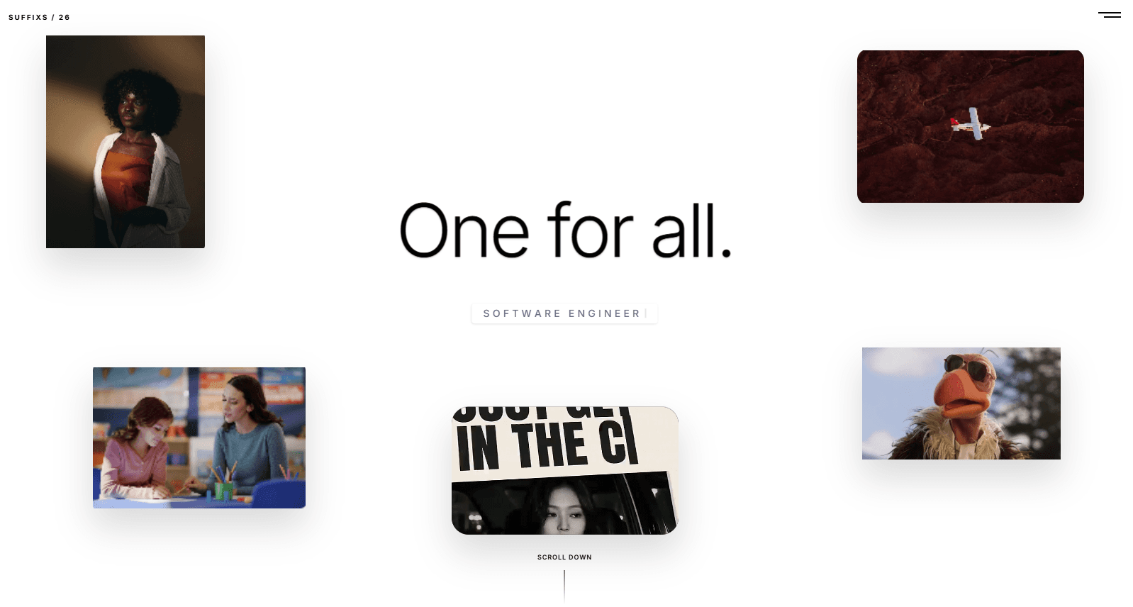
Suffixs Portfolio is a carefully crafted portfolio site built to showcase creative work through a clean, editorial lens. The entire experience is wrapped in a black and white color palette, letting the projects speak for themselves without unnecessary visual noise.
Visual Direction
The design leans heavily into contrast. Deep blacks frame every element while white typography and subtle gray accents guide the eye through the page. This monochrome approach creates a timeless, professional feel that works across photography, motion design, and development portfolios.
Motion & Interactions
Parallax effects are used throughout the site to add depth without distracting from the content. As users scroll, background layers move at different speeds than foreground content, creating a sense of dimensionality. Scroll-triggered animations reveal text, images, and project cards at just the right moment, keeping the browsing experience fluid and engaging.
Technical Approach
The site is built with performance in mind. Animations are hardware accelerated where possible, and the layout stays responsive across all device sizes. Every transition is intentional — nothing flashes or moves without purpose. The result is a portfolio that feels alive but never overwhelming.
Why It Works
By stripping away color and leaning into motion, the portfolio puts focus entirely on the work. Visitors remember the experience because it feels intentional, polished, and confident. It proves that great design does not need loud colors to make a loud statement.